
A bearing does not fail in one moment. Its vibration changes over hours and days: an impact appears, the spectrum develops structure, RMS rises, and eventually the machine reaches a point where continuing to run is no longer worth the risk.
That makes bearing degradation a better test for a decision model than a handful of isolated alerts. The question is not simply whether the model can name one event. It is whether its judgment moves in the right direction as the physical evidence gets worse.
We tested that question with a 2B local model and a real run-to-failure dataset already stored in Arc.
Arc reduced more than 20 million time-aligned vibration rows into 984 snapshots. We selected 96 points across the bearing's life and gave the model a compact state for each one. The model did not see the timestamp, snapshot number, or time remaining before the test rig stopped.
Its exact maintenance label matched our evaluation policy in 65.6% of the windows. That is not a result we would use to automate maintenance.
The probability-weighted risk score was much more interesting. It had a 0.92 rank correlation with the known failure stage and ordered 96.2% of pairs from different stages correctly. As the bearing degraded, the score generally rose with it.
This is not a story about replacing vibration analysis or maintenance engineers. It is a story about a small local model turning evidence prepared by Arc into a useful ranking signal, and about where that signal may fit in a real condition-monitoring workflow.
The bearing run
The source is NASA's IMS bearing dataset. Four Rexnord bearings ran on a shaft at 2,000 rpm under a 6,000-pound radial load. Accelerometers recorded one second of vibration at 20 kHz every ten minutes. After almost seven days, bearing 1 developed an outer-race failure and the rig stopped.
Our earlier article, Keep the Waveform. A Bearing Fails in Arc, One Sample at a Time., explains how we imported the complete run, how the interactive waveform and spectrum work, and why retaining raw vibration matters.
For this experiment, we used the same live Arc dataset:
| Dataset property | Value |
|---|---|
| Time-aligned rows in Arc | 20,152,320 |
| Bearing channels per row | 4 |
| Snapshots | 984 |
| Samples per snapshot | 20,480 |
| Time between snapshots | 10 minutes |
| Total run | 163.8 hours |
| Known outcome | Outer-race failure on bearing 1 |
You can explore the run in the interactive demo. Press play to follow the waveforms, pause to inspect the raw samples and spectrum, or jump to the first point where bearing 1 exceeds twice its day-one RMS baseline.
From raw vibration to model evidence
We did not send 20,480 waveform samples to the decision model. Arc first aggregated the entire run into one row per ten-minute snapshot:
arcli query --database bearing_monitoring -o json \
  "SELECT
     time_bucket(INTERVAL 10 MINUTE, time) AS bucket,
     min(snapshot) AS snapshot,
     sqrt(avg(b1 * b1)) AS rms_b1,
     max(abs(b1)) AS peak_b1,
     kurtosis(b1) AS kurtosis_b1,
     sqrt(avg(b2 * b2)) AS rms_b2,
     sqrt(avg(b3 * b3)) AS rms_b3,
     sqrt(avg(b4 * b4)) AS rms_b4
   FROM vibration
   WHERE test_id = 'ims-2'
   GROUP BY bucket
   ORDER BY bucket"
The query scanned the stored run and returned all 984 snapshots in 156 milliseconds on the demos instance.
For each point we wanted to evaluate, we built a compact evidence object containing:
- bearing 1's current RMS, peak and kurtosis against its day-one baseline;
- the preceding two hours, split into recent and prior one-hour windows;
- the change between those two windows;
- the count of recent snapshots above twice the RMS baseline;
- the current RMS ratios of bearings 2, 3 and 4 as controls.
The peer bearings matter. If all four channels move together, the cause may be load, speed, mounting, or another shared condition. If one bearing separates from the others, the evidence for a local mechanical problem is stronger.
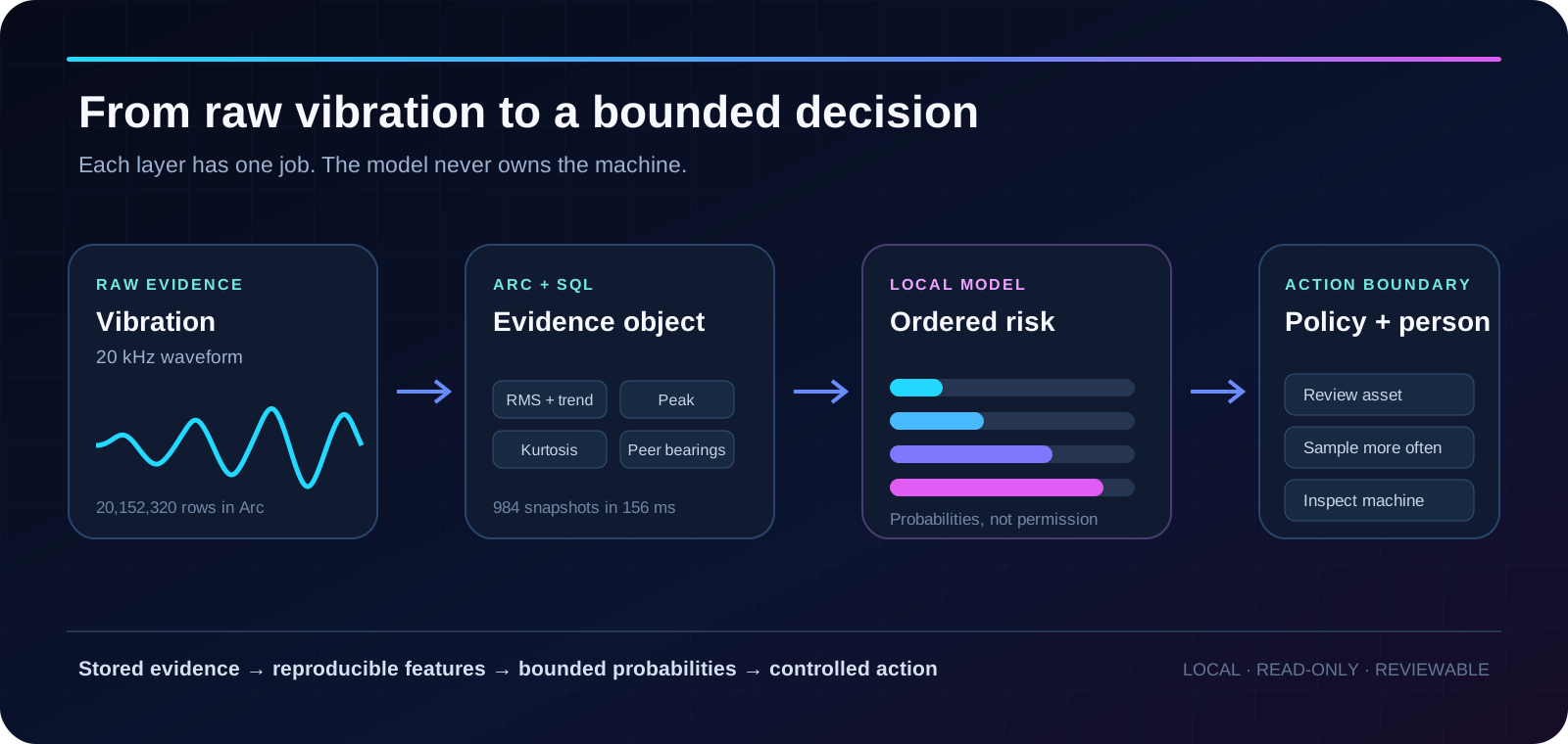
This separation is deliberate. Arc owns the raw history and the reproducible feature calculation. The model receives a small, inspectable state. A policy layer and a person retain control of what happens to the machine.
The local decision model
We used Jev-Style-Qwen3.5-2B-Decision, an independent Apache-2.0 checkpoint based on Qwen3.5-2B, loaded locally as jev-style-qwen3.5-2b-decision.
The model follows the Jev-style decision pattern: present a bounded question and a set of criteria, then return a probability for each option. It is not TypeSafe AI's hosted Jev and is not affiliated with or endorsed by TypeSafe.
We asked one question:
Rate the mechanical risk shown by the observed vibration evidence on this ordered scale.
The four options were:
- Healthy baseline: vibration is close to baseline and stable.
- Emerging deviation: vibration is materially different and deserves closer observation.
- Persistent degradation: evidence supports planning maintenance soon.
- Severe mechanical risk: vibration is extreme or accelerating enough to justify an immediate stop and inspection.
These were bounded interpretations of the evidence, not permissions to stop equipment.
Building a 96-window replay
Because the rig's final stopping time is known, we divided the run into four evaluation stages:
| Evaluation stage | Time before the rig stopped | Windows sampled |
|---|---|---|
| Continue routine monitoring | More than 48 hours | 24 |
| Increase monitoring | 24 to 48 hours | 24 |
| Schedule maintenance | 4 to 24 hours | 24 |
| Stop and inspect | Less than 4 hours | 24 |
We selected 24 evenly spaced snapshots from each stage. The model saw the vibration evidence for each point, but we deliberately withheld the snapshot number, timestamp, stage, and remaining time.
The stages are an evaluation policy, not a universal maintenance standard. A real threshold depends on the asset, operating state, failure mode, redundancy, safety consequences, and the time required to plan an intervention. Here, the stages give us a known ordering against which to test the model's signal.
Why we kept the probabilities
If we take only the model's most likely option, we force every point into one of four boxes. Two adjacent stages can be nearly tied but appear as a hard disagreement.
Instead, we also calculated the expected value of the probability distribution:
risk score = Σ(level index × probability of that level)The levels are indexed from 0 to 3. A score near 0 places most probability around the healthy baseline. A score near 3 places it around severe mechanical risk.
This does not create a new physical unit. It gives us a continuous summary of the model's ordered judgment.
The exact labels were uneven
The model's top option matched the evaluation stage in 63 of 96 windows, or 65.6%.
Performance varied sharply by stage:
| Evaluation stage | Mean RMS vs. baseline | Mean model risk, 0–3 | Exact top-option accuracy |
|---|---|---|---|
| Continue routine monitoring | 1.06× | 0.89 | 75.0% |
| Increase monitoring | 1.67× | 1.74 | 25.0% |
| Schedule maintenance | 2.15× | 1.90 | 83.3% |
| Stop and inspect | 4.82× | 2.14 | 79.2% |
The “increase monitoring” stage was the weak point. Many of its windows landed on an adjacent level. That is exactly the kind of result a top-label metric punishes, even when the probability distribution has shifted in the correct direction.
We would not deploy this as a four-class maintenance classifier.
The risk ordering was much stronger
The continuous risk score followed the run more consistently than the exact labels:
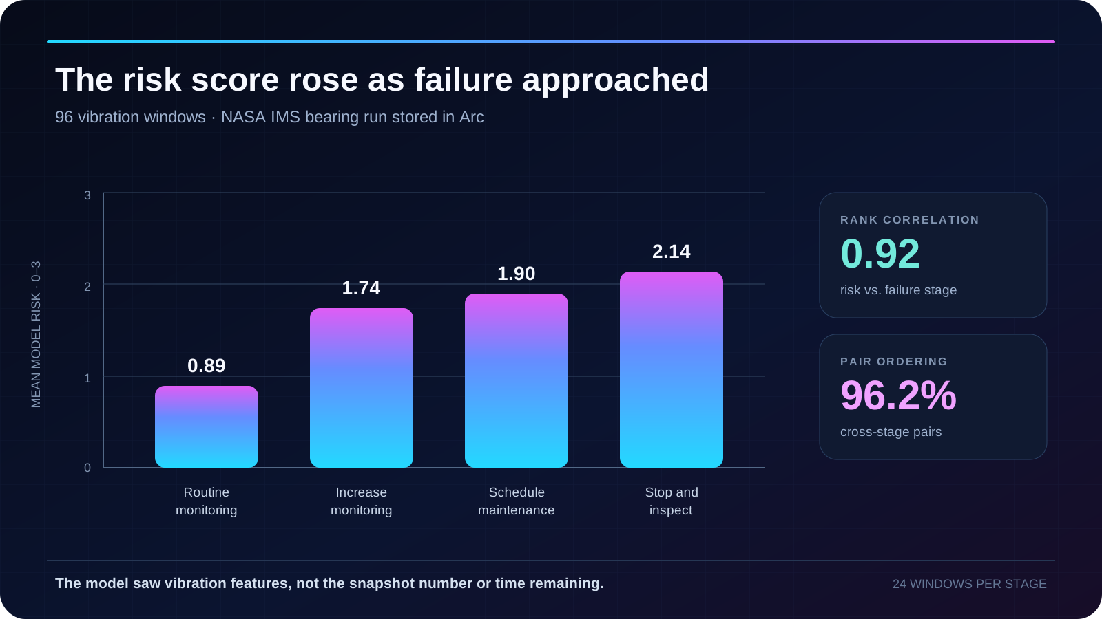
Across all 96 windows:
- Spearman correlation between model risk and failure stage was 0.92;
- correlation between model risk and bearing 1's RMS ratio was 0.96;
- 96.2% of pairs drawn from different stages were ordered in the expected direction;
- each local decision took 0.49 seconds on average.
The pair result means that when we selected one point from an earlier stage and one from a later stage, the later point received the higher risk score 96.2% of the time.
That is useful for ranking. A fleet view does not always need a perfect diagnosis for every asset. It may need to identify which five machines deserve attention first, which sensor should temporarily sample more often, or where a technician should open the waveform and spectrum.
Why not use an RMS threshold?
For this single run, a deterministic RMS rule is the first baseline to beat. It is cheaper, transparent, and already finds the point where bearing 1 exceeds twice its day-one level. The model's 0.96 correlation with RMS is not evidence that it replaced vibration engineering. It shows that the model reacted strongly to a feature we explicitly provided.
The model becomes interesting when the decision depends on several imperfect signals together: RMS level, trend, peak, kurtosis, persistence, peer sensors, operating context, and asset history. A probability distribution can combine that evidence into a ranking while still exposing uncertainty to the surrounding application.
But “interesting” is not “better.” A production evaluation should compare the model against simple rules and classical condition-monitoring methods on multiple assets and multiple failure runs. If the simpler method performs as well, use the simpler method.
What the experiment actually shows
The model did not discover a fault from raw vibration. Arc and SQL calculated the features, and the model received those values directly. Its contribution was mapping a compact set of measurements into a smooth, ordered judgment.
The evaluation also has important limits:
- all 96 windows come from one bearing in one run;
- nearby windows are correlated, so they are not 96 independent failures;
- the time bands were defined by us after the run was complete;
- there was no second failure run reserved as a holdout set;
- the experiment measured ordering, not whether maintenance at a given point would have improved the outcome.
The result is strong enough to motivate a larger evaluation. It is not strong enough to establish a maintenance policy.
Where this could fit
The first useful deployment would be local, read-only, and in shadow mode.
Arc would continue storing the raw waveform and computing reproducible features. Existing rules would continue to own hard limits. The model would record its probability distribution and risk score without controlling equipment. Technicians could then compare its ranking with inspections, work orders, and eventual outcomes.
If it proves useful across assets, the score could support a few bounded tasks:
- rank machines for technician review;
- increase sampling frequency when evidence starts to change;
- choose which diagnostic query or visualization to open next;
- add context to an alert without turning that context into an automatic shutdown;
- run at the plant edge when vibration data cannot leave the site.
The action boundary remains conventional code and human judgment. A local model can suggest where to look. It should not decide by itself when a machine stops.
What comes next
The more interesting next step is not a larger model. It is more failures: different bearings, loads, speeds, fault modes and operating conditions, evaluated against deterministic baselines and held-out runs.
One bearing gave us a promising signal. A fleet would tell us whether it generalizes.
Build on your own data
Arc keeps raw, high-frequency telemetry queryable, so you can revisit old events, calculate new features, and evaluate new models without rebuilding the history first.
Download Arc and start with the data your machines are already producing.